Thandie Media
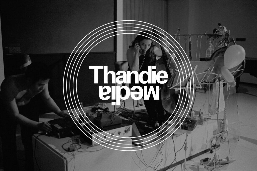
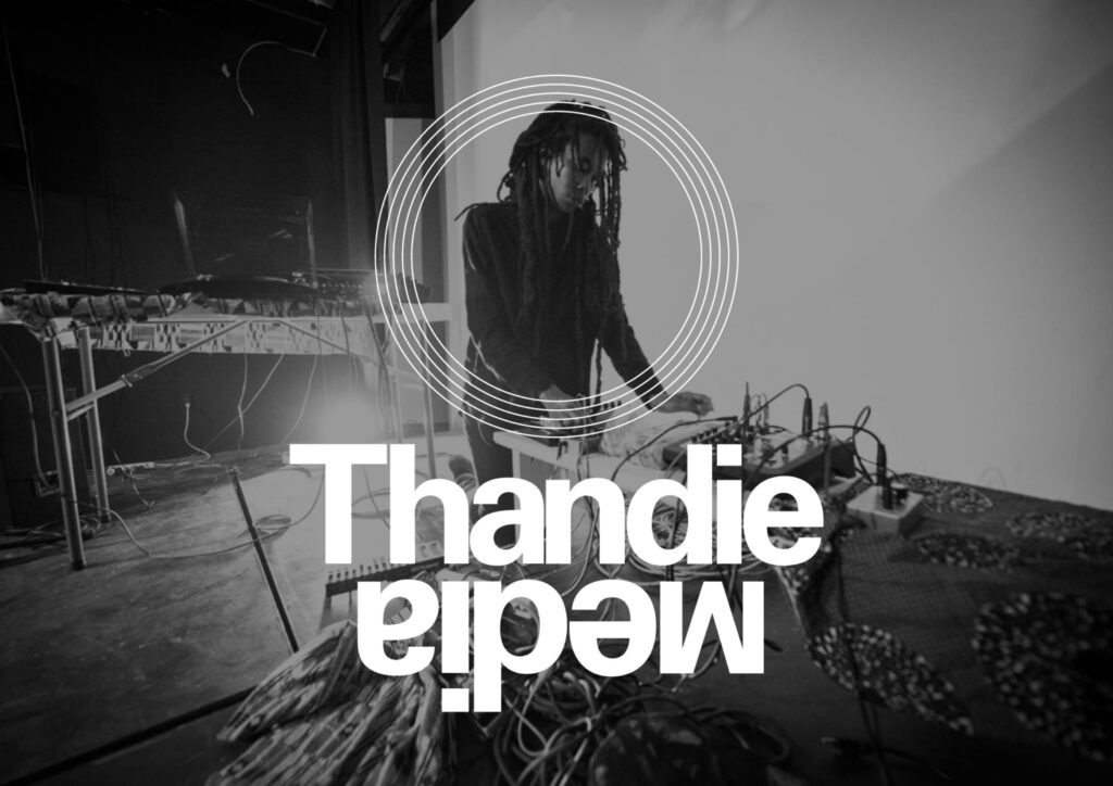
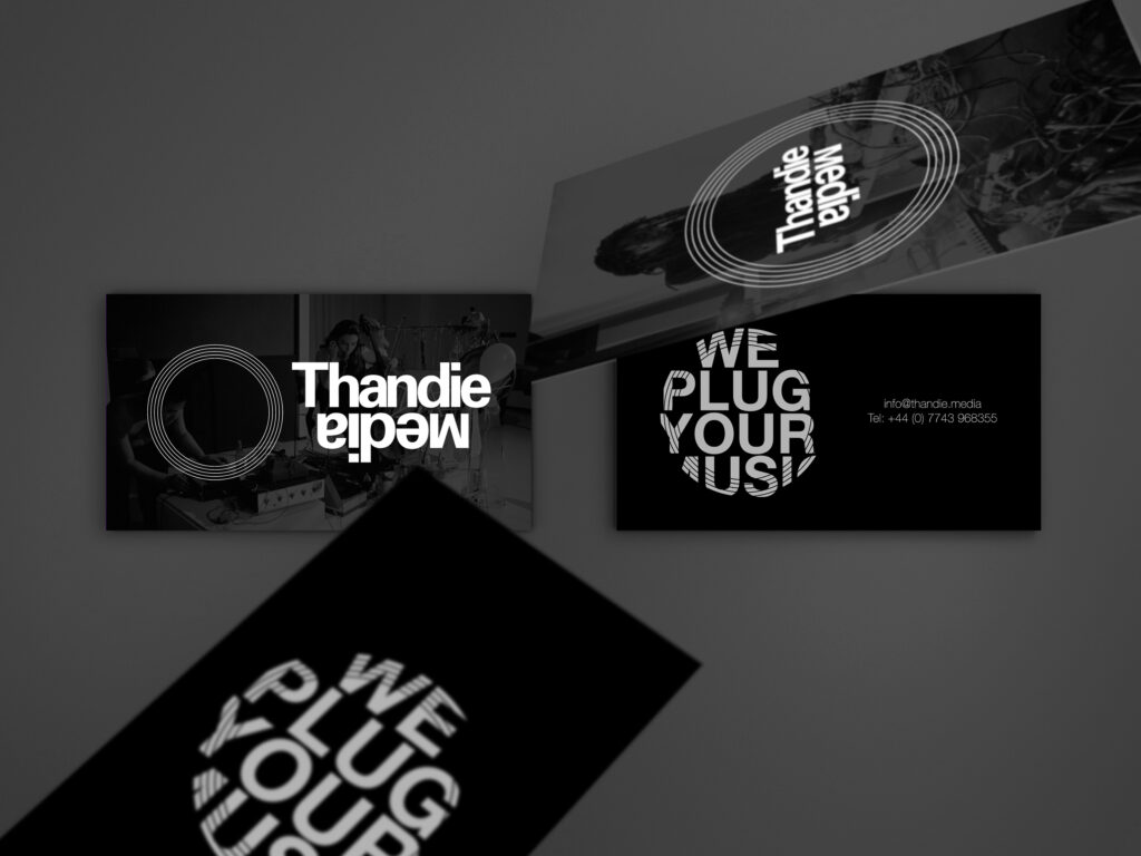
Thandie is a communication agency within the music industry. With this rebranding we wanted to portray avant-garde and global attributes that the agency associates with.
While Africa is still recognised for its lack of innovation, this company wants bridge a gap between African music and the world, flipping the stereotypes that this continent is an underdeveloped reality.
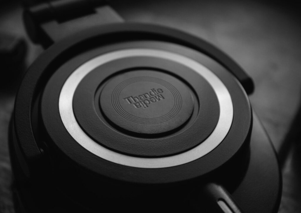
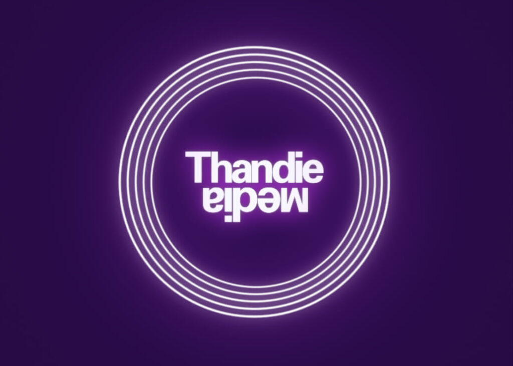
For this reason, the text is flipped indicating that this company is all about change, but also because I wanted to evoke the line of the equator and the global scale at which this company operates.
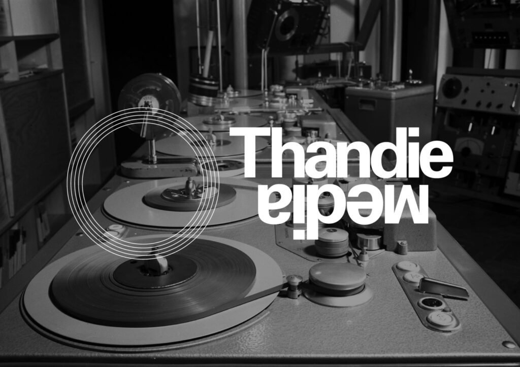
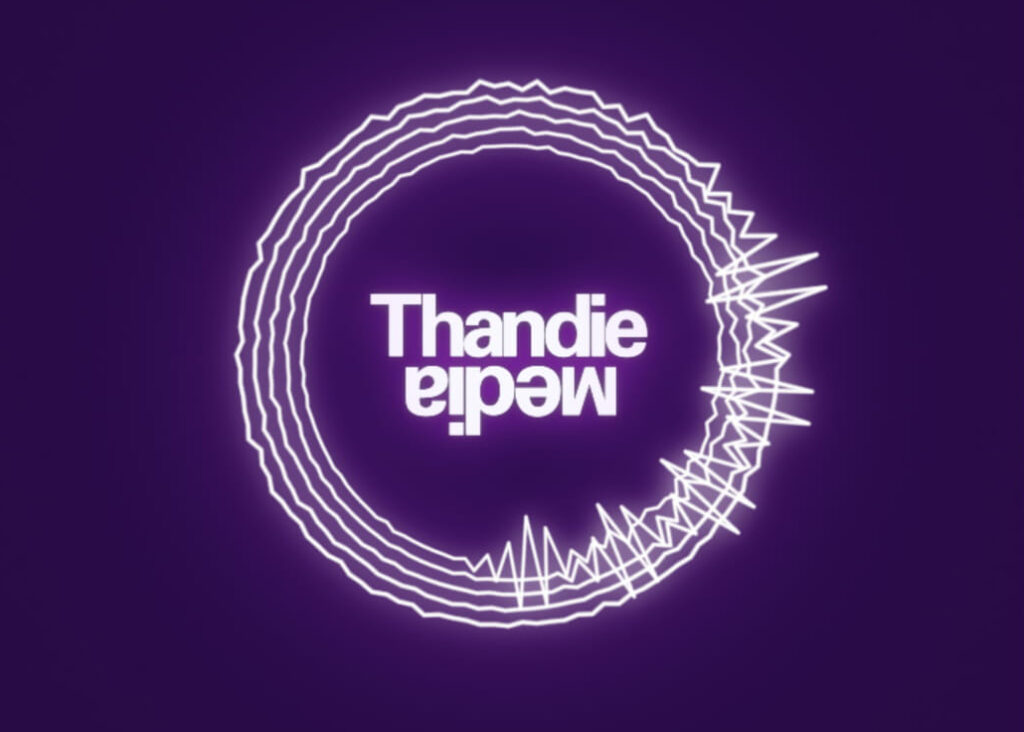
The main logo mark is inspired by a vinyl phonograph record. This sound storage system was the primary medium used for music reproduction throughout the 20th century, but still commonly used by DJ in modern framework.
This shape is also made from 5 lines, like a musical score, now that music is being made greatly relying on technology.
I wanted to incorporate these old fashioned symbols because only by acknowledging and learning from the past we can anticipate the future.
