Sept 17, 2018
Design That Works—And Design That Wanders
How Uber’s Identity Crisis Became a Masterclass in What Not to Do—And What We Can Learn From It
By Sofia Cianciulli
There’s a special kind of pain that happens when a brand gets lost in its own reflection. Uber, we’re looking at you.
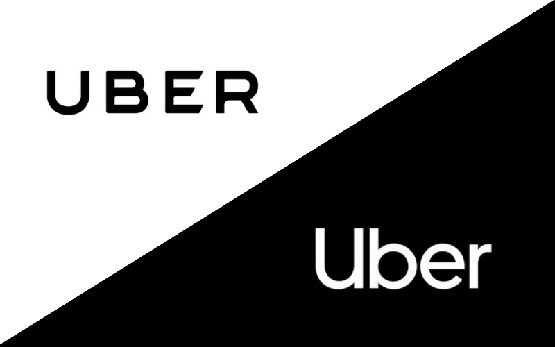
The transportation and logistics giant just launched its second rebrand in under three years. That’s not a refresh—that’s a design identity crisis with a hefty price tag.
You’d think a company with global reach, Silicon Valley cash, and millions of users would have a solid grip on its visual language by now. But no. What we’re seeing is the exact opposite: confusion, inconsistency, and a serious disconnect between design and strategy.
Let’s break it down.
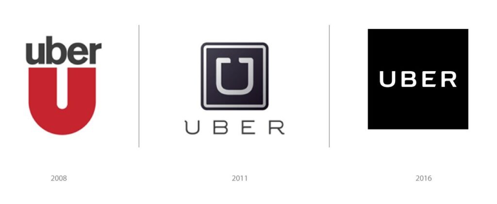
In 2016, after a period of hyper-growth, Uber’s founder and then-CEO Travis Kalanick decided the brand needed a “grounded and inspiring” look. So he jumped headfirst into the creative process—not as a collaborator, but as a decision-maker. The result? A logo no one understood, a visual identity that screamed “tech startup trying to be deep,” and an app icon that looked like a rejected microchip design.
Gone was the clean, recognizable “U.” In its place? A symbol inspired by “bits and atoms,” whatever that means to your average rider just trying to get to the airport. (Spoiler: it means nothing.)
And now? It’s 2017, and they’re already rebranding again. That’s a lot of signage, swag, print, and digital assets getting tossed in the bin.
When Design Is Dictated by Ego, Not Empathy
Kalanick reportedly led the 2016 rebrand alongside Uber’s internal team in what they called “The War Room.” Red flag #1. Design by war metaphor? Yikes. Design isn’t battle—it’s listening. It’s empathy. It’s collaboration.
But instead of building a brand rooted in user connection, they built one rooted in one guy’s personal taste. And let’s be clear: Travis isn’t a designer. He’s a tech founder. That’s a different skill set.
The result of this founder-fueled experiment was a disjointed identity that lacked warmth, recognition, or coherence. The app icon looked nothing like the logotype. The logotype looked nothing like the brand’s community-focused initiatives like UberAngel. And the whole system? Felt cold, corporate, and oddly sterile.
Uber might be a tech company, but it’s also a people company. Real humans use this service every day in 300+ cities. The branding should have reflected that. Instead, it felt like a branding thesis for an AI start-up.
Now We’re Watching the Cleanup
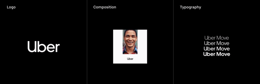
The new logo (yes, already!) just dropped. It’s cleaner, more legible, and thank god, it actually says “Uber.” But it still raises questions. Why the uppercase “U” with a spur that makes it read like a lowercase? Why strip the brand of any distinguishing character? It’s like they’re afraid of having a point of view.
This is the real cost of bad design: not just money, but trust. You confuse your users. You dilute your identity. You burn through budget—not on growth, but on course-correction.
Compare that to Apple. Apple’s identity is consistent, elegant, and human. From the store experience to the unboxing moment, everything says: “We thought of you.”
Now that’s design as strategy. Not design as drama.
The silver lining in this messy Uber moment? They’re learning in public. That’s valuable. Not every brand is brave enough to say: “Hey, we missed the mark. Let’s do better.”
The new direction—while maybe not as bold—is at least a step toward clarity. They’ve brought in external partners. The design is finally reflecting the user, not the ego. And as a branding nerd, I respect the course correction.
This also reminds us: design is not just a visual exercise. It’s business strategy in disguise. It affects perception, trust, customer retention, and market position.
So if you’re leading a brand and thinking about a rebrand, please—don’t do it from a War Room. Do it from a place of clarity, empathy, and collaboration. Design deserves more than impulse. It deserves intention.
Let’s build brands that don’t need a rebrand every 18 months.
xo,
Studio Vagari